

Colour Theory in Office Design: Boosting Morale and Productivity
In the bustling corporate culture world, office design is indispensable in cultivating a conducive environment for work. colour theory, often overlooked, is a pivotal component that can significantly influence the ambiance of a workspace. By harnessing the science behind hues, we can craft interiors that amplify aesthetics and turbocharge morale and productivity.
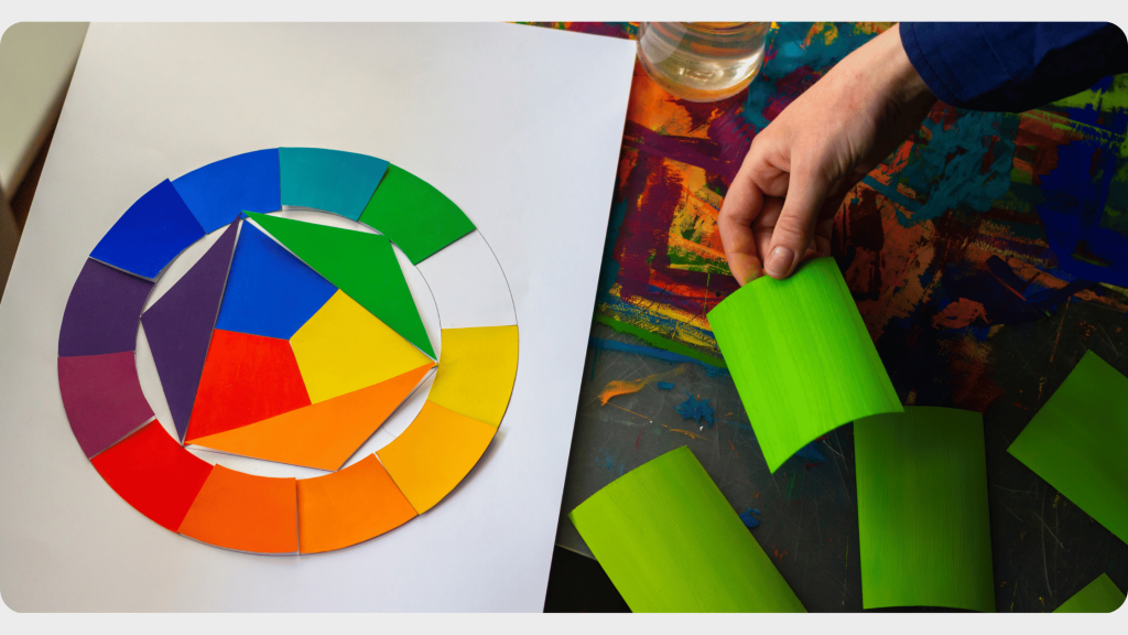
The Psychology Behind Colours
Every colour exudes a distinct emotion, shaping our perceptions and behaviours. For instance, blue often resonates with tranquillity and reliability, while red evokes energy and urgency.
- Blue: Ideal for brainstorming spaces, this colour promotes clear thinking and concentration. It has a calming effect, reducing stress and fostering a sense of stability.
- Red: Best utilized in areas where active tasks are performed. It stirs excitement and can stimulate faster decision-making.
- Green: Associated with nature and wellness, green can rejuvenate the mind, especially during prolonged work sessions.
- Yellow: This vibrant hue sparks creativity. Suitable for design studios or innovation hubs, yellow can instill optimism and encourage collaboration.
Strategic Placement of colours
It’s not just about selecting the right colours; it’s about placing them wisely. Strategic colour placement can guide employee movement, emphasize key areas, and enhance workflow.
- Meeting Rooms: Opt for shades of blue and green. These colours foster communication and promote a relaxed atmosphere conducive to open discussions.
- Workstations: A blend of neutral tones with hints of blue can create a serene environment, aiding focus and minimizing distractions.
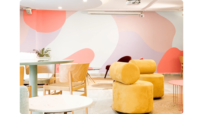
- Break Areas: Warm hues like orange or yellow can invigorate and uplift, offering a refreshing break from work.
Colour Intensity Matters
While the choice of colour is pivotal, the shade’s intensity can also influence reactions. Vibrant shades can invigorate, while muted tones can soothe.
- Pastels: Subdued colours, like pastels, can instill a sense of calm and are excellent for spaces dedicated to deep work or reflection.
- Brights: These are ideal for dynamic spaces such as innovation labs or marketing departments, where high energy and creativity are paramount.
Incorporating Brand Identity
Integrating your brand colours into the office design can foster a strong sense of belonging. It reinforces brand identity and strengthens employee alignment with the company’s values and missions.
Balancing with Neutrals
While diving deep into colour theory, we mustn’t overlook the role of neutrals. Whites, grays, and beiges offer balance. They act as a canvas, allowing other colours to pop and preventing sensory overload.
Adapting to Changing Needs
It’s pivotal to remember that as companies evolve, so do their design needs. Considering colour theory, periodic reassessments of office interiors can ensure that the workspace remains aligned with the organization’s goals and the well-being of its employees.
Conclusion
Harnessing the nuances of colour theory in office design is not mere artistry; it’s a strategic endeavour. When executed with precision, it can transform a mundane workspace into a hub of inspiration, innovation, and productivity. By making informed colour choices, we can craft environments that nourish the mind, bolster morale, and pave the way for heightened productivity.